Subscribe to our ▶️ YouTube channel 🔴 for the latest videos, updates, and tips.
Represent Data on a Bar Graph
We will learn how to represent data on a bar graph. A bar graph is a simple way of presenting data. Bar graph is a method of presenting data by drawing rectangular bars of equal width and with equal space between the two bars. Bar graphs can be drawn using horizontal or vertical bars.
A bar graph must be drawn on a graph sheet. A bar graph must have a tittle written above the bar graph.
The information in a bar graph is represented along the horizontal and vertical axis. the horizontal axis generally represents the periods or intervals and vertical axis represents the quantity.
Each axis has a label. The label depicts the information represented on each axis. The bars can be shaded or colored suitably. A convenient scale is chosen to decided about the width of bars, and marking the numbers or values on the vertical axis.
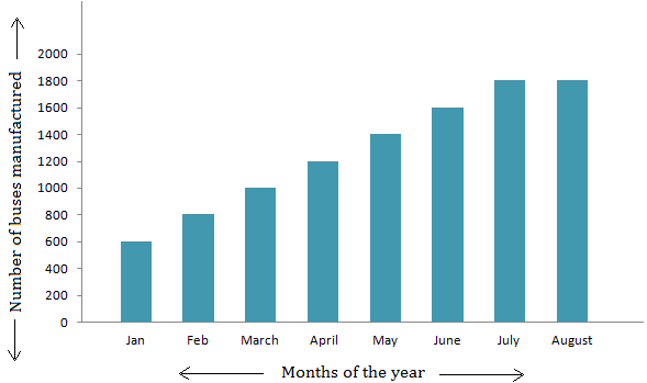
We have seen how pictograph represents a pattern of information through numerical data in general. But such representation takes much time and sometimes, drawing picture symbols make it more difficult. So, instead of using picture symbols, it is easier to use bars with equal width (rectangles) to represent the number of buses.
Look at the following bar graph representation.
Such a representation of data with the help of bars is called a bar graph. The bars can be shaded or coloured.
Types of bar graphs
There are two types of bar graphs:
(i) Horizontal bar graph (ii) Vertical bar graph
Horizontal Bar Graph
Let us consider an example:
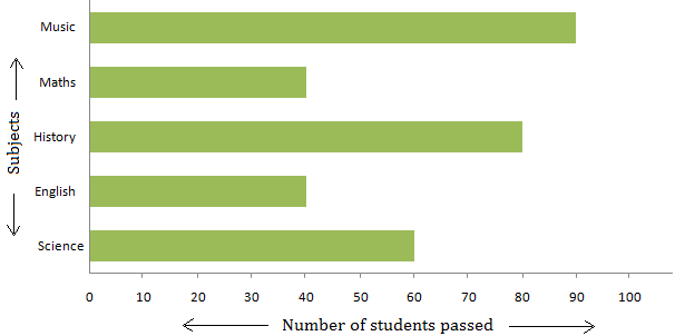
Draw a horizontal bar graph based on the following data.
Solution:
The bar graph gives us the following information.
(i) The number of students passed in different subjects.
(ii) The maximum number of students passed in Music.
(iii) The minimum number of students passed in English and Maths.
(iv) The student performed best in Music and worst in English and Maths.
Vertical Bar Graph
Let us take some examples.
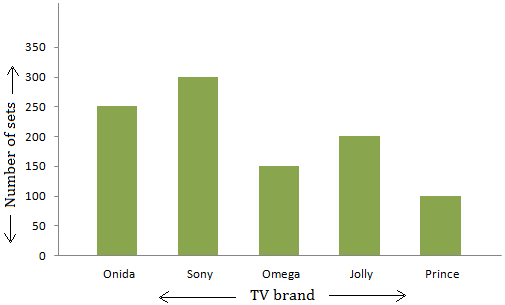
1. Draw a vertical bar graph based on the following data.
Solution:
The graph gives us the following information.
(i) The number of different brand of T. V. Sets manufactured on a certain day.
(ii) The production of Sony TV sets was maximum on that day.
(iii) The production of Prince TV sets was minimum on that day.
We can say that a bar graph is a pictorial representation of the numerical data by a number of bars (rectangles) having the same width drawn horizontally or vertically with equal space between them.
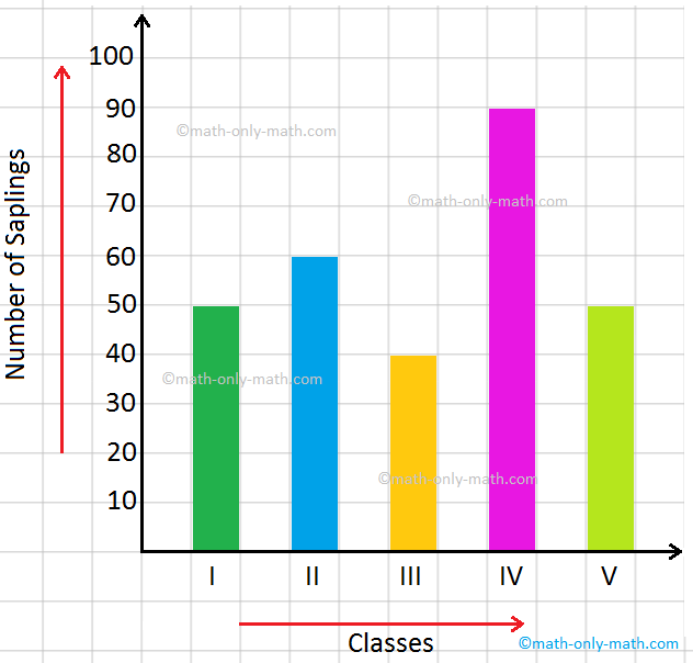
2. Look at the bar graph given below. What information does the bar graph depicts?
The bar graph depicts here the number of saplings planted by students of classes from 1 to 5. The title of the bargraph of saplings planted. The scale used here is 1 square = 10 saplings.
Now, observe the above bar graph and answer the questions that follow.
(i) How many saplings were planted in all?
50 + 60 + 40 + 90 + 50 = 290
(ii) Write the scale of the above bar graph.
1 square = 10 saplings
(iii) Which two classes planted the same number of saplings?
Class I and Class V
(iv) Given 2 reasons why we should grow plants ____________________
From Represent Data on a Bar Graph to HOME PAGE
Didn't find what you were looking for? Or want to know more information about Math Only Math. Use this Google Search to find what you need.


New! Comments
Have your say about what you just read! Leave me a comment in the box below. Ask a Question or Answer a Question.