Subscribe to our ▶️ YouTube channel 🔴 for the latest videos, updates, and tips.
Cumulative-Frequency Curve
Group data are also represented by a curve called ogive or cumulative-frequency curve. As the name suggests, in this representation cumulative frequencies of different class intervals play an important role.
Method of Constructing on Ogive:
Step I: Prepare a frequency-distribution table with overlapping class intervals to make the distribution continuous.
Step II: Prepare the cumulative-frequency table for the distribution.
Step III: Plot points on the horizontal axis (class-interval axis) corresponding to the upper limits of the class intervals.
Step IV: Draw perpendicular to the horizontal axis at the points representing upper limits of the class intervals. The length of the perpendiculars should represent the cumulative frequencies of the corresponding class intervals. In other words, plot points with coordinates (a, c), where a = upper limit of a class interval and c = the corresponding cumulative frequency.
Step V: Join the points plotted in step IV freehand to get a smooth curve.
Step VI: Join the first point to the point representing the lower limit of the first class interval in continuation with the smooth curve in step V. (This part of the curve may be a dotted line segment.)
Example: Draw an ogive for the following distribution.
Class Interval
0 - 20
20 - 40
40 - 60
60 - 80
80 - 1000
Frequency
4
6
5
3
2
Solution:
The cumulative-frequency table for the distribution is as given below.
Class Interval
0 - 20
20 - 40
40 - 60
60 - 80
80 - 1000
Frequency
4
6
5
3
2
Cumulative Frequency
4
10
(4 + 6)
15
(4 + 6 + 5)
18
(4 + 6 + 5 + 3)
20
(4 + 6 + 5 + 3 + 2)
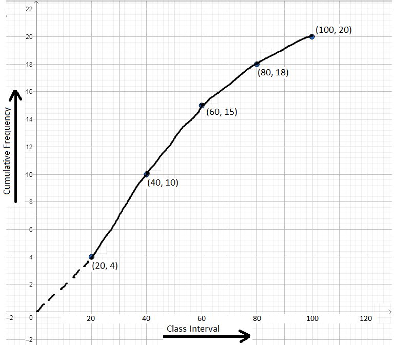
Now, plot the points (20, 4), (40, 10), (60, 15), (80, 18) and (100, 20) following the steps 3 and 4, and join the points following step 5 and 6. We get the following ogive.
Scale: On the x-axis, 1 cm = width of interval.
On the y-axis, 2 mm = cumulative-frequency 1.
Note: The ogive discussed above is also known as “less than” ogive.
A “more than” ogive can also be drawn by considering “more than” cumulative frequencies for the class intervals. The cumulative-frequency table for “more than” ogive in the above example will be as below.
Class Interval
0 - 20
20 - 40
40 - 60
60 - 80
80 - 1000
Frequency
20
16
(20 - 4)
10
(16 - 6)
5
(10 - 5)
2
(5 - 3)
Now, plotting the points (0, 20), (20, 16), (40, 10), (60, 5), (80, 2) [i.e., (lower limit, “more than” cumulative frequency)] and joining them by a smooth curve, we get the “more than” ogive.
Utility of Ogives:
An ogive for a frequency distribution displays cumulative frequencies of different class intervals. As such it helps to find the median, and the upper and lower quartiles of a distribution which will be discussed later in this book.
From Cumulative-Frequency Curve to HOME PAGE
Didn't find what you were looking for? Or want to know more information about Math Only Math. Use this Google Search to find what you need.


New! Comments
Have your say about what you just read! Leave me a comment in the box below. Ask a Question or Answer a Question.