Construction of Bar Graphs
Now we will discuss about the construction of bar graphs or column graph. In brief let us recall about, what is bar graph?
Bar
graph is the simplest way to represent a data.
● In consists of rectangular bars of equal width.
● The space between the two consecutive bars must be the same.
● Bars can be marked both vertically and horizontally but normally we use vertical bars.
● The height of bar represents the frequency of the corresponding observation.
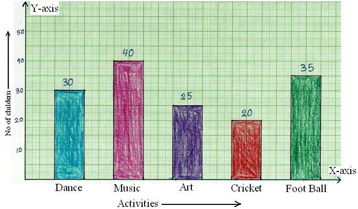
For example, let us observe the following data of the bar graph.
The following data gives the information of the number of children involved in different activities.
| Activities | Dance | Music | Art | Cricket | Football |
| No. of Children | 30 | 40 | 25 | 20 | 53 |
How to Construct a Bar Graph?
Steps in construction of bar graphs/column graph:
● On a graph, draw two lines perpendicular to each other, intersecting at 0.
● The horizontal line is x-axis and vertical line is y-axis.
● Along the horizontal axis, choose the uniform width of bars and uniform gap between the bars and write the names of the data items whose values are to be marked.
● Along the vertical axis, choose a suitable scale in order to determine the heights of the bars for the given values. (Frequency is taken along y-axis).
● Calculate the heights of the bars according to the scale chosen and draw the bars.
Bar graph gives the information of the number of children involved in different activities.
Solved examples on construction of bar graphs:
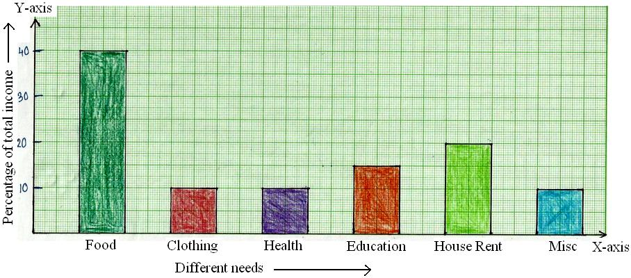
1. The percentage of total income spent under various heads by a family is given below.
| Different Heads | Food | Clothing | Health | Education | House Rent | Miscellaneous |
| % Age of Total Number |
40% | 10% | 10% | 15% | 20% | 5% |
Represent the above data in the form of bar graph.
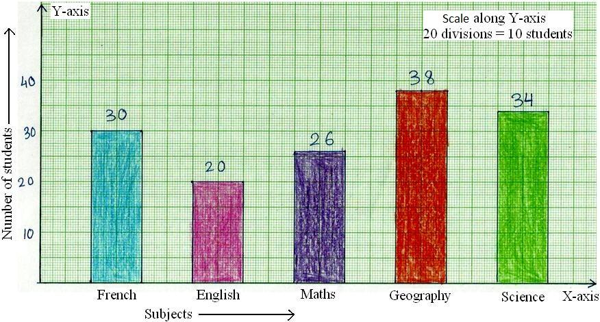
2. 150 students of class VI have popular school subjects as given below:
| Subject | French | English | Maths | Geography | Science |
| Number of Students | 30 | 20 | 26 | 38 | 34 |
Draw the column graph/bar graph representing the above data.
Solution:
Take the subjects along x-axis, and the number of students along y-axis
Bar graph gives the information of favourite subjects of 150 students.
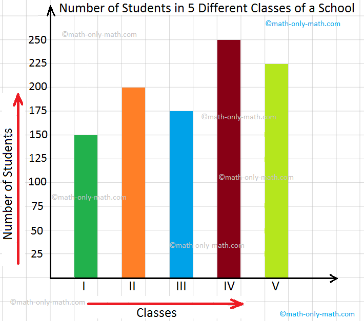
3. Number of students in 5 different classes of a school is given below. Read the data and represent it through a bar graph.
Classes
I
II
III
IV
V
Number of Students
150
200
175
250
225
Let us draw a bar graph to represent the given information.
(i) Draw a horizontal axis and mark the points on the line to show class I, class II, class III, class IV, class V at convenient intervals.
(ii) Draw a vertical axis and chose the 1 square = 25 students to mark the points to represent number of students.
(iii) Draw bars of equal thickness for each class keeping equal gap between the bars.
(iv) Give the title as number of students in 5 different classes of a school.
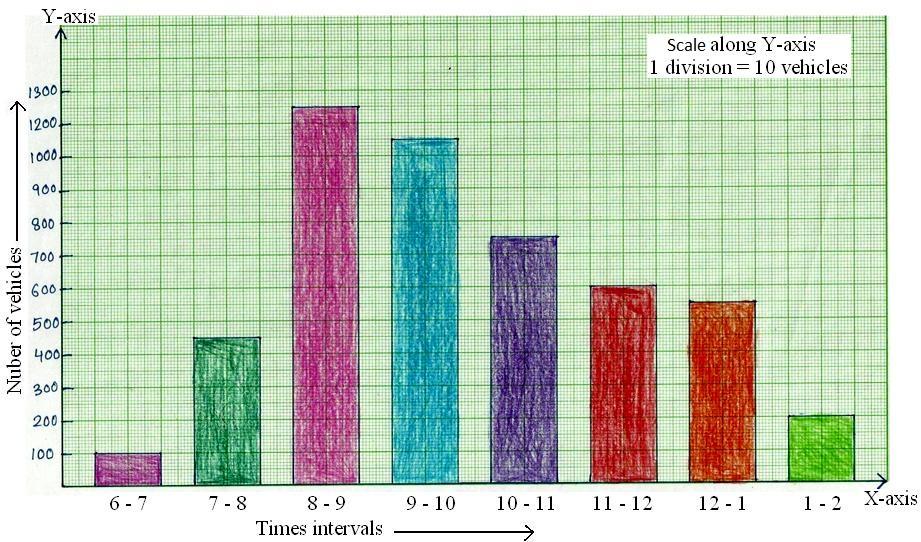
4. The vehicular traffic at a busy road crossing in a particular place was recorded on a particular day from 6am to 2 pm and the data was rounded off to the nearest tens.
| Time in Hours | 6 - 7 | 7 - 8 | 8 - 9 | 9 - 10 | 10 - 11 | 11 - 12 | 12 - 1 | 1 - 2 |
| Number of Vehicles | 100 | 450 | 1250 | 1050 | 750 | 600 | 550 | 200 |
Bar graph gives the information of number of vehicles passing through the crossing during different intervals of time.
Reading a Bar Graph:
Information can also be shown on other kinds of charts. We can make charts on squared paper also. They are called bar graph. A bar graph has bars of different heights.
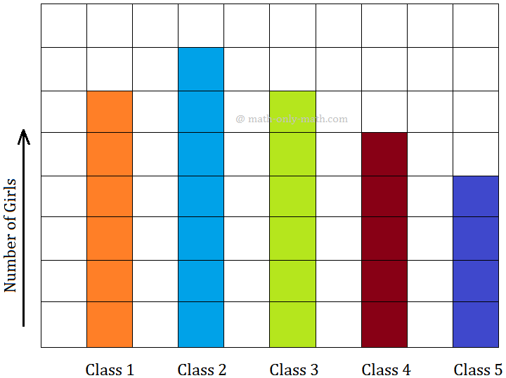
1. Look at the bar graph given below. Each bar shows the number of girls in the classes.
Read the bar graph & fill in the blanks.
(i) How many classes are there in the school?
(ii) How many girls are there in class 1?
(iii) Total number of girls in the school.
(iv) Total number of girls in classes 4 & 5.
(v) Which class has maximum girls?
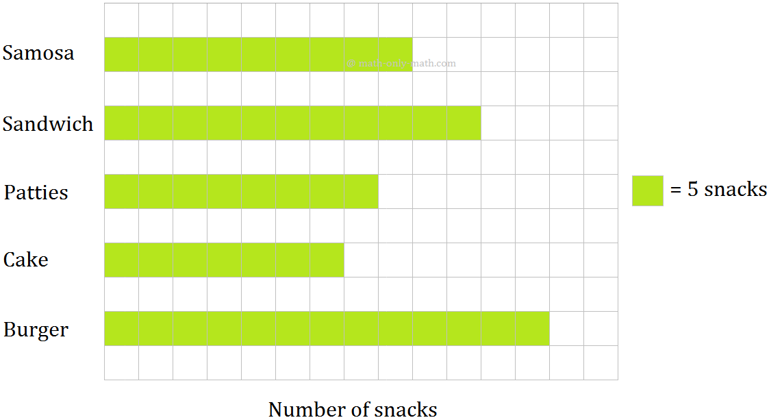
2. The following bar graph shows the different types of snacks available at snacks shoppy.
Read the bar graph & fill in the blanks.
(i) How many snacks are there in the snacks shoppy?
(ii) How many sweets are there in snacks shoppy?
(iii) Which snacks are available in maximum number and how much?
(iv) Which snacks are available in minimum number and how much?
(v) In how much quantity your favorite snack is available?
3. The number of cycles produced by a factory in a week for 5 days is given below.
Monday
Tuesday
Wednesday
Thursday
Friday
700
800
1000
900
1200
Draw a bar graph with respect of the above information.
Solution:
Steps to draw the bar graph are as follows.
Step I: On a graph paper, draw a horizontal and vertical line.
Step II: Along a horizontal line, mark the days at points taken at equal distance.
Step III: Choose the scale as 1 division = 100 cycles
Step IV: The height boars as follows:
Production on Monday \(\frac{1}{100}\) × 700 = 7th division.
Production on Tuesday \(\frac{1}{100}\) × 800 = 8th division.
Production on Wednesday \(\frac{1}{100}\) × 1000 = 10th division.
Production on Thursday \(\frac{1}{100}\) × 900 = 9th division.
Production on Friday = \(\frac{1}{100}\) × 1200 = 12th division.
Step V: Draw bars of equal width and height as calculated in the Step IV at the points marked in Step II as shown in the bar graph.
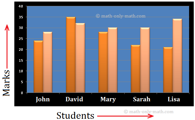
4. A maths teacher checked weather the new technique of teaching he applied alter quarterly test was effective or not. He took the scores of the 5 weakest children in the quarterly test (our of 50) and in the half yearly test (out of 50) as follows:
Students
John
David
Mary
Sarah
Lisa
Quarterly
24
35
28
22
21
Half Yearly
28
32
30
30
34
Construct a bar graph to represent the above data.
Solution:
The required bar graph is as shown below:
Scale: 1 big division = 5 marks
● Statistics
-
Real Life Statistics
- Terms Related to Statistics
- Frequency Distribution of Ungrouped and Grouped Data
- Use of Tally Marks
- Class Limits in Exclusive and Inclusive Form
- Construction of Bar Graphs
- Mean
- Mean of the Tabulated Data
- Mode
- Median
- Construction of Pie Chart
- How to Construct a Line Graph?
From Construction of Bar Graphs to HOME PAGE
Didn't find what you were looking for? Or want to know more information about Math Only Math. Use this Google Search to find what you need.
Recent Articles
-
Subtraction of 4-Digit Numbers | Subtract Numbers with Four Digit
Jan 12, 25 03:23 AM
We will learn about the subtraction of 4-digit numbers (without borrowing and with borrowing). We know when one number is subtracted from another number the result obtained is called the difference. -
3rd Grade Addition Worksheet | 3-Digit Addition | Word Problems | Ans
Jan 11, 25 01:06 PM
In 3th Grade Addition Worksheet we will solve how to addition of 3-digit numbers without regrouping, addition of three 3-digit numbers without regrouping, addition of 3-digit numbers with regrouping… -
Addition of 4-Digit Numbers | 4-Digit Addition |Adding 4-Digit Numbers
Jan 11, 25 03:16 AM
We will learn about the addition of 4-digit numbers (without carrying and with carrying). We know how to add 2 or 3, 3-digit numbers without carrying or with carrying. -
Worksheet on Addition of 4-Digit Numbers | 4 Digit Addition Worksheets
Jan 11, 25 02:48 AM
Practice the questions given in the worksheet on addition of 4-digit numbers. Here we will add two 4-digit numbers (without carrying and with carrying) and three 4-digit numbers -
Word Problems on 4-Digit Numbers |Addition and Subtraction of 4-Digits
Jan 10, 25 02:49 PM
We will solve here some of the word problems on addition and subtraction of 4-digit numbers. We will apply the same method while adding and subtracting the word problems. 1. In a village, there are 25…






New! Comments
Have your say about what you just read! Leave me a comment in the box below. Ask a Question or Answer a Question.