Subscribe to our ▶️ YouTube channel 🔴 for the latest videos, updates, and tips.
Bar Graph or Column Graph
What is a bar graph or column graph?
A bar graph or column graph is a pictorial representation of numerical data in the form of rectangles (or bars) of equal width and varying heights.
These rectangles are drawn either vertically or horizontally, keeping equal space between them. The height (or length of a rectangle depends upon the numerical value it represents.
How to draw a bar graph or column graph?
or
How to make a bar graph or column graph?
Suppose some numerical data is given to us, and we have to represent graphs by a bar graph on a graph paper.
We can make the graphs and charts by following the steps given below:
Step 1: On a graph paper, draw a horizontal line OX and a vertical line OY. These lines are the x-axis and the y-axis respectively.
Step 2: Mark points at equal intervals along the x-axis. Below these points write the names the data items whose values are to be plotted.
Step 3: Choose a suitable scale. On that scale determine the heights of the bars for the given values.
Step 4: Mark off these heights parallel to the y-axis from the points taken in Step 2.
Step 5: On the x-axis, draw bars of equal width for the heights marked in Step 4. They should be centered on the points marked on the x-axis. These bars represent the numerical data.
Now let us look at some examples showing how bar graph or column graph are drawn.
Examples of bar graphs or column graphs:
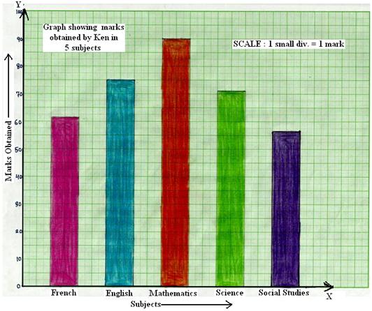
1. The marks obtained by Ken in his annual examination are shown below:
| Subject | French | English | Mathematics | Science | Social Studies |
|---|---|---|---|---|---|
Draw a bar graphing charts to represent the above data.
Solution:
We can draw the charts and graphs by following these steps:
Step 1: On a graph paper, draw a horizontal line OX and a vertical line OY, representing x-axis and the y-axis respectively.
Step 2: Along OX, write the names of the subjects at points taken at uniform gaps.
Step 3: Choose the scale: 1 small division ≡ 1 mark.
Step 4: Then, the heights of the various bars are:
French = 63 small divisions,
English = 75 small divisions,
Mathematics = 90 small divisions,
Science = 72 small divisions and
Social studies = 58 small studies
Step 5: On the x-axis, draw bars of equal width and of heights obtained in Step 4 at the points marked in Step 2.
The completed bar charts or column charts are shown below.
Graph showing marks obtained by Ken in five subjects
2. The number of cycles produced in a factory during five consecutive weeks is given below:
| Week | First | Second | Third | Fourth | Fifth |
|---|---|---|---|---|---|
| No. of Cycle Produced |
Draw a bar graph or column graph representing the above information.
Solution:
We can draw the bar graphs by following these steps:
Step 1: On a graph paper, draw a horizontal line OX and a vertical line OY, representing the x-axis and the y-axis respectively.
Step 2: Along OX, mark the weeks at points taken at equal gaps.
Step 3: Choose the scale: 1 small division ≡ 20 cycles.
Step 4: The heights of the bars are:
Production in the 1ˢᵗ week = (¹/₂₀ × 800) = 40 small divisions
Production in the 2ⁿᵈ week = (¹/₂₀ × 1300) = 65 small divisions
Production in the 3ʳᵈ week = (¹/₂₀ × 1060) = 53 small divisions
Production m the 4ᵗʰ week = (¹/₂₀ × 920) = 46 small divisions
Production in the 5ᵗʰ week = (¹/₂₀ × 1440) = 72 small division
Step 5: Draw bars of equal width and of own heights calculated in Step 4 at the points marked in Step 2.
The graph bar or graph column is shown below:
Bar graph showing the production of cycles in a factory during five consecutive weeks
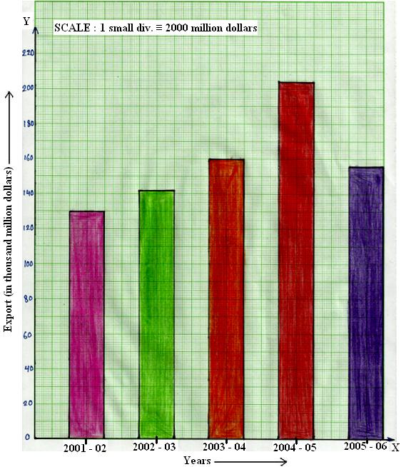
3. The following table shows the exports earnings on America (in thousand million dollars) during five consecutive years:
| Year | 2001-02 | 2002-03 | 2003-04 | 2004-05 | 2005-06 |
|---|---|---|---|---|---|
Draw a bar graph representing the above data.
Solution:
We can make a bar graph by following these steps:
Step 1: On a graph paper, draw a horizontal line OX and a vertical line OY, representing the x-axis and the y-axis respectively.
Step 2: Along OX, mark the years at points taken at equal gaps.
Step 3: Choose the scale: 1 small division ≡ 2 thousand million dollars.
Step 4: Then, the heights of the bars are:
Export in 2001—2002 = (¹/₂ × 130) = 65 small divisions
Export in 2002—2003 = (¹/₂ × 142) = 71 small divisions
Export in 2003—2004 = (¹/₂ × 160) = 80 small divisions
Export in 2004—2005 = (¹/₂ × 204) = 102 small divisions
Export in 2005—2006 = (¹/₂ × 156) = 78 small divisions
Step 5: At the points marked in Step 2, draw bars of equal width and of heights calculated in Step 4.
Bar graph showing export earnings of America during five consecutive years
How to read bar graphs?
From a bar graph, we can draw certain conclusions. This is known as reading or interpretation of the bar graph or column graph.
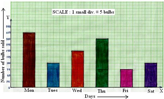
4. Given below is a graph showing the number of electric bulbs sold in a shop during a week.
Read the bar graph or column graph carefully and answer the questions given below:
(i) On which day of the week was the sale minimum?
(ii) On which day of the week was the sale maximum?
(iii) What was the total sale during the week?
(iv) What is the ratio between the minimum sale and the maximum sale?
Solution:
(i) It is clear from the bar graph that the bar of minimum height corresponds to the sale on Friday.
Therefore, the sale was minimum on Friday.
(ii) From the bar graph, we find that the bar of maximum height corresponds to the sale on Monday.
Therefore, the sale was maximum on Monday.
(iii) The total sale during the week = (225 + 100 + 150 + 200 + 75 + 100) bulbs = 850 bulbs.
(iv) The minimum sale during the week = 75 bulbs.
The maximum sale during the week = 225 bulbs.
Therefore, minimum sale : maximum sale = 75 : 225 = 1 : 3.
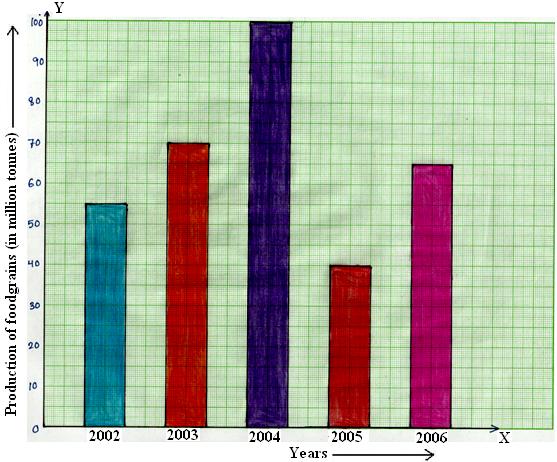
5. A column graph is given below.
Production of foodgrains in an Indian state during five consecutive years
Read the bar graph carefully and answer the question given below:
(i) What information is given by the bar graph?
(ii) In which year was the production maximum?
(iii) After which year was there a sudden fall in the production?
(iv) Find the ratio between the maximum production and the minimum production during the given period.
Solution:
(i) The given bar graph shows the annual production (in million tones) of food grains in an American state during the period from 2002 to 2006.
(ii) It is clear that the bar of maximum height corresponds to the year 2004. So the production was maximum in that year.
(iii) From the bar graph, we find that there was a sudden fall in the production after the year 2004.
(iv) The maximum production during 5 years = 100 million tones.
The minimum production during 5 years = 40 million tones.
Therefore, maximum production : minimum production = 100 : 40 = 5 : 2.
● Constructing and Interpreting Bar Graphs or Column Graphs
● Bar Graphs or Column Graphs - Worksheets
Worksheet on Bar Graphs or Column Graphs
8th Grade Math Practice
From Bar Graph or Column Graph to HOME PAGE
Didn't find what you were looking for? Or want to know more information about Math Only Math. Use this Google Search to find what you need.


New! Comments
Have your say about what you just read! Leave me a comment in the box below. Ask a Question or Answer a Question.